Benefits
Many citizens look to government to tackle our biggest problems—climate change, cybercrime, etc. With nodes of complexity, effective communication can unite efforts. It can increase public engagement and improve internal efficiency between departments. Shared information should not just be available, but meaningful.
There’s much at stake—whether providing social benefits or explaining how to comply with government requirements. An effective communication strategy can result in less errors, less questions from the public, and less resources spent on enforcement.
Know your audience
People process and recall information differently. Simple language and patterns can reduce cognitive load. To use public services, an exhaustive understanding of government administration should not be required. User experiences should be intuitive. In essence, users must:
- Find what they need
- Understand what they find
- Use what they understand
Often, citizens are not accessing services for fun, but to complete a task. In fact, the Government of Canada tracks top tasks on their website (e.g. applying for a work permit).
Ethnographic research can identify user needs and reveal what users already know. Check out the user research methods published by the UK Government. Each decision should be rationalized by a research insight (e.g. better continuity, legibility, etc.). Overall, information should be accurate, authoritative, and understandable. To get started, 18F Methods is an excellent collection of research tools previously developed by the US Government.
Understand the regulatory landscape and technical constraints. Test assumptions early and often. Create clear specifications that address concerns of bias, privacy, accountability, transparency, and proportionality. By defining “rules of engagement” users can anticipate desired outcomes and understand their part to play. Aligned with this approach, the UK has established a set of government design principles.
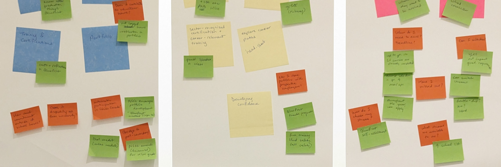
I recently led a UX workshop for a government service.
Information architecture
Tactful structure allows a user to gain familiarity and sense of place when interacting with government services. Information can be “chunked” or organized into sections that reflect a natural pause. Headings allow a user to scan or predict what’s coming up. Opt for bullet lists, not numbered lists, when order doesn’t matter. Use descriptive wording for link text. This educates the user on where they’ll be re-directed.
Treatment of elements should be consistent, not necessarily uniform. You can find pattern libraries and common-code repositories for government websites such as Canada (including Ontario), US, and UK. Likewise, guidelines on editorial style and tone are also available for Canada (including Ontario), US, and UK.
Plain language
Explaining with too many words is like a cuttlefish hiding itself in ink. In a complex legislative landscape, users should not be mystified by mumbo jumbo. Try a friendly conversational tone instead of a legal bureaucratic one. If necessary, provide a glossary for acronyms (try to avoid alphabet soup!).
In general, active voice (e.g. Sue wrote the report) is better than passive voice (e.g. The report was written by Sue). These considerations support users with english as a second language—especially since Google Translate often inaccurately converts complex grammar.
The Social Security Tribunal of Canada has some great writing strategies for easy comprehension and retention. In fact, they were applauded by the Center for Plain Language in this case study. Similarly, the US Government has developed plain language guidelines. For a more in-depth review, try “How to write clearly” published by European Commission staff.
Time to start writing! Test readability of your text with the Hemingway Web App.